The pieces people
stopped for.
A curated wall of campaigns across food, beauty, fashion, tech, and automotive, each built to catch the eye and earn the click. Filter by discipline below.
Every selected piece, across every industry. Curated, not catalogued.
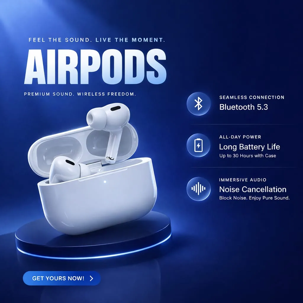
A launch key-visual for wireless audio: spec callouts, glow staging, and a confident all-caps lockup.
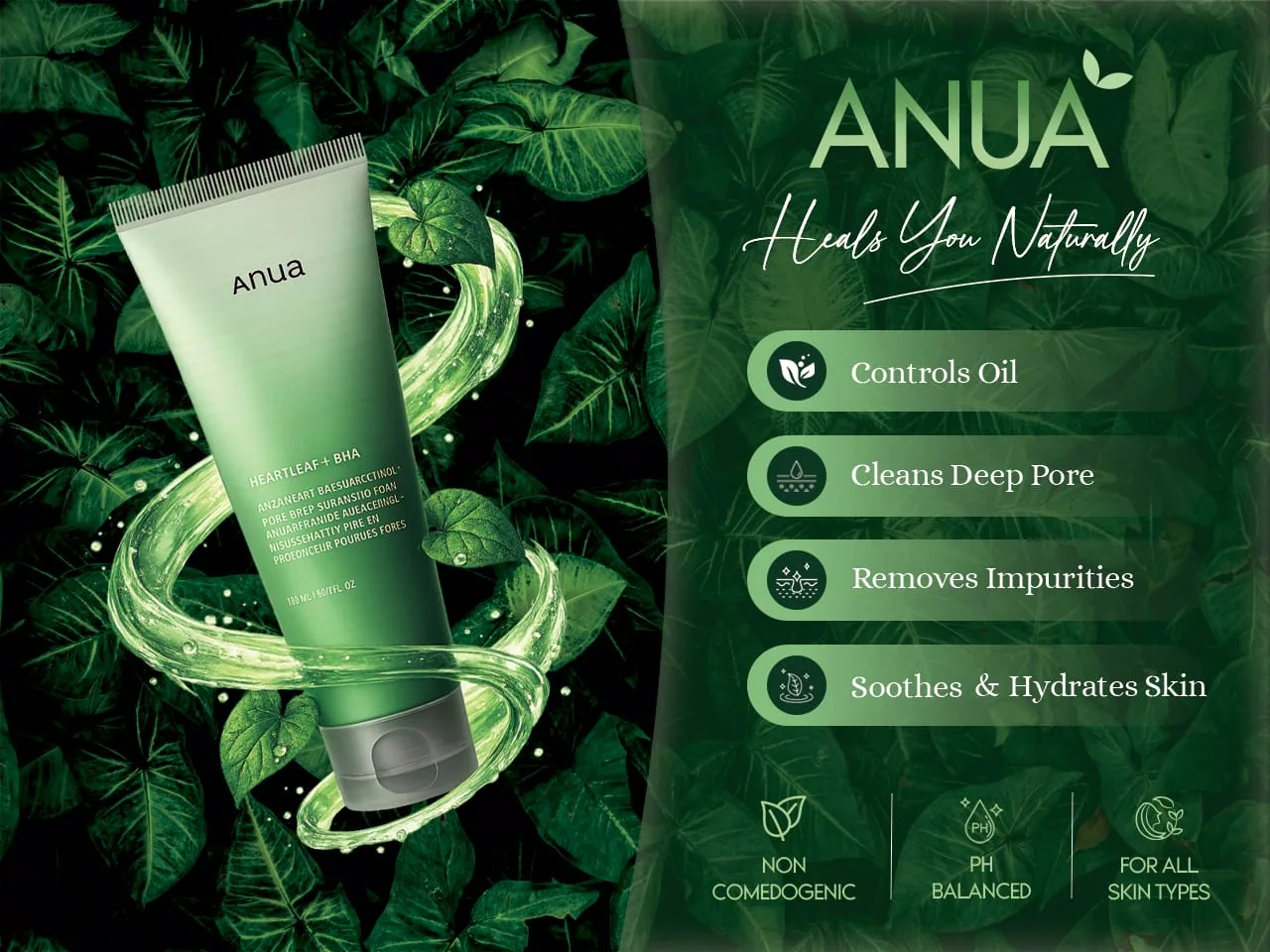
A botanical skincare banner with benefit pills, layered foliage, and a calm, trustworthy hierarchy.
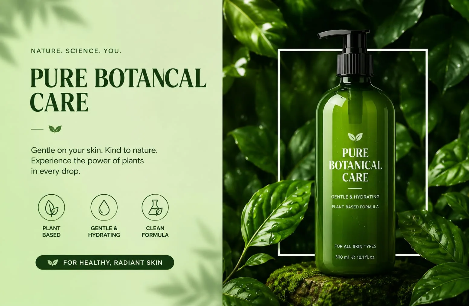
Clean split-layout product story with an icon system: nature-forward, editorial, and legible.
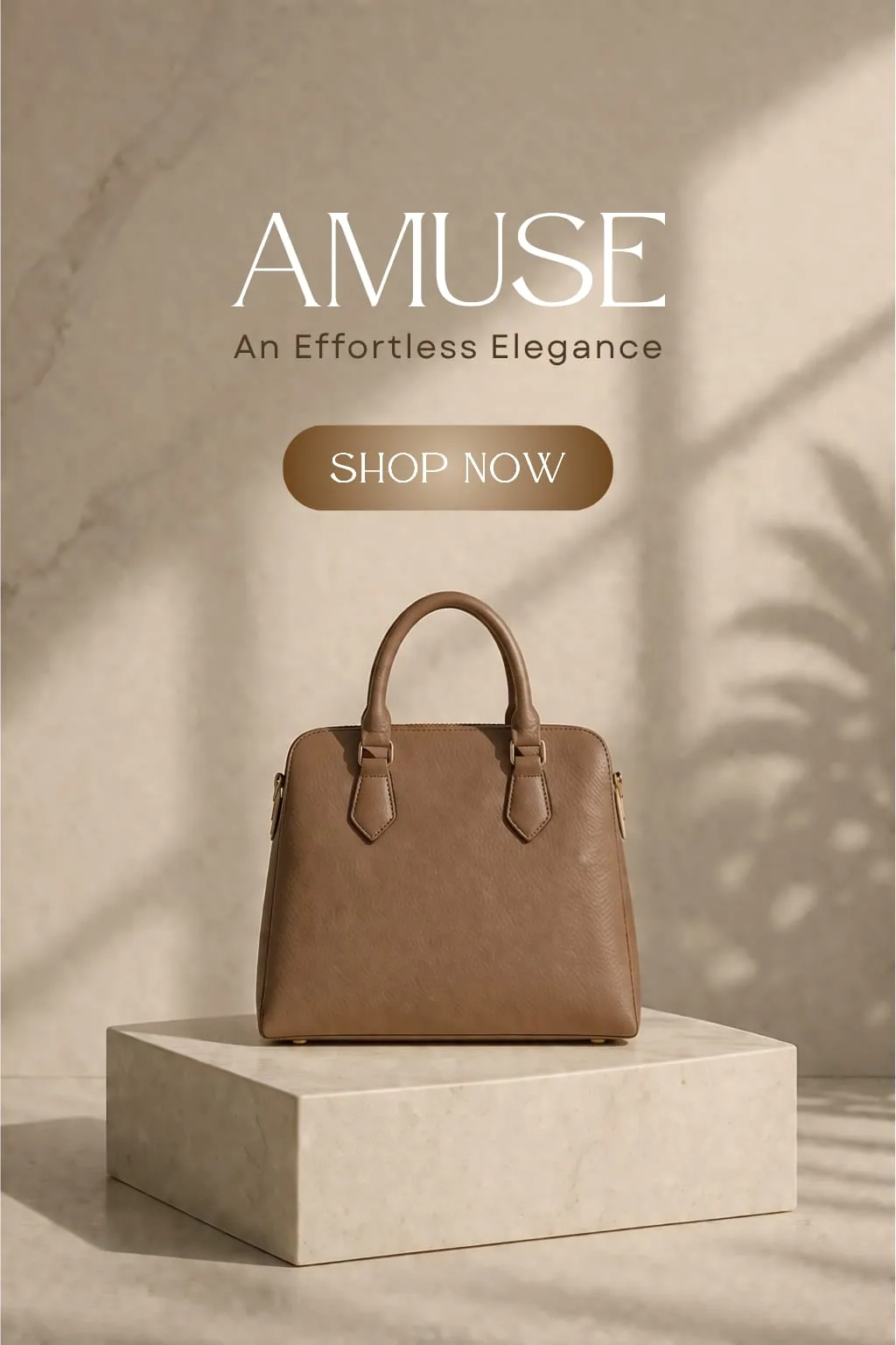
A fashion feature with restrained type and warm neutrals, where luxury is told through space and light.
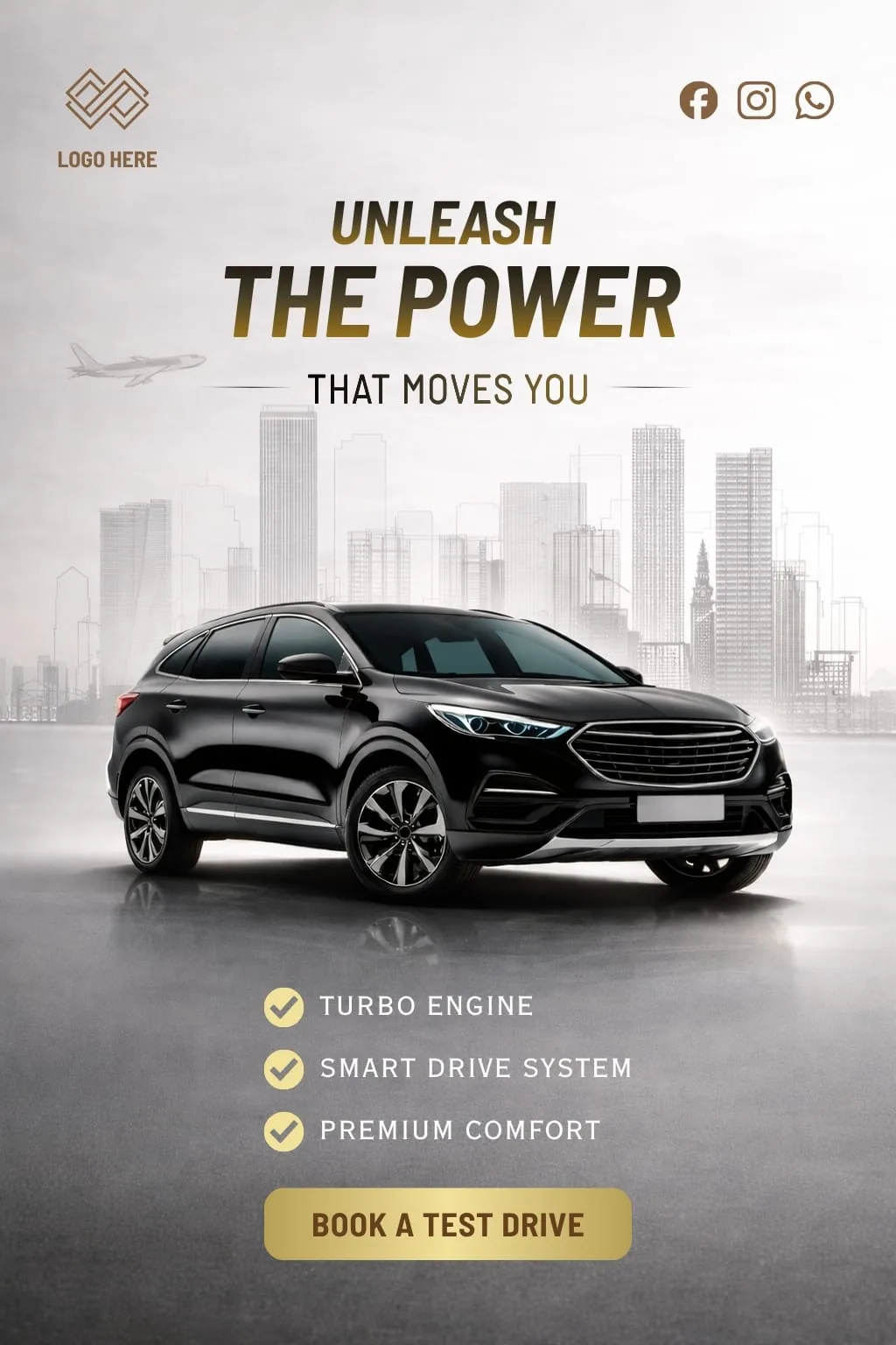
A premium automotive ad with gold gradients, cityscape depth, and a decisive booking CTA.
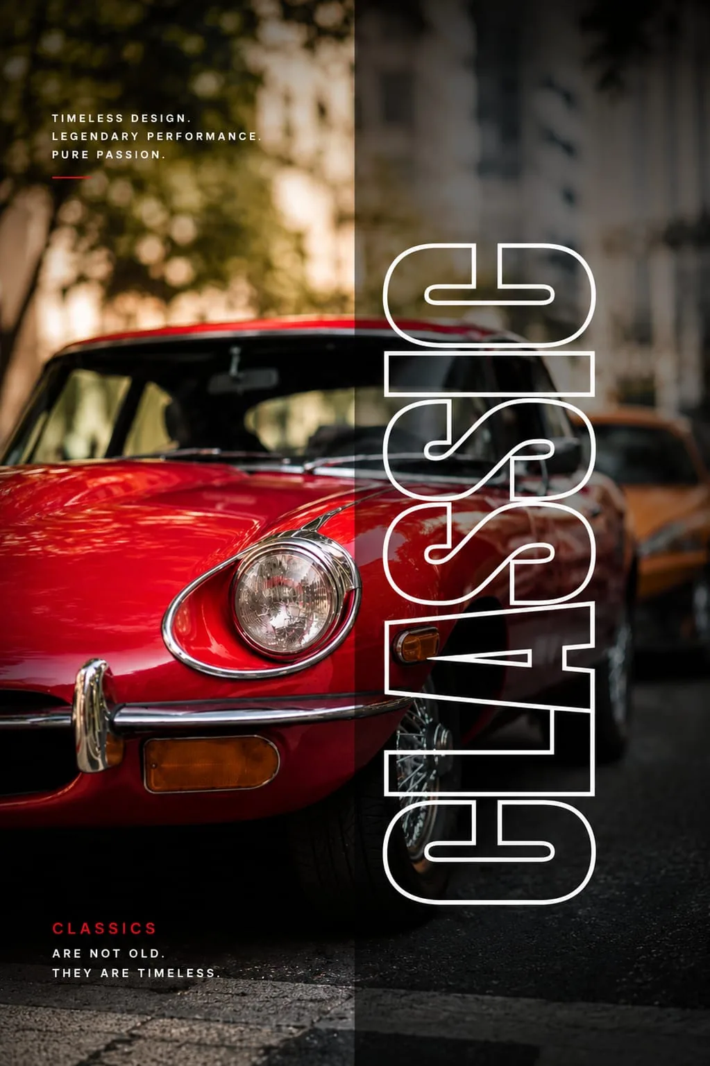
A kinetic poster with an outlined vertical wordmark riding over a duotone classic car.
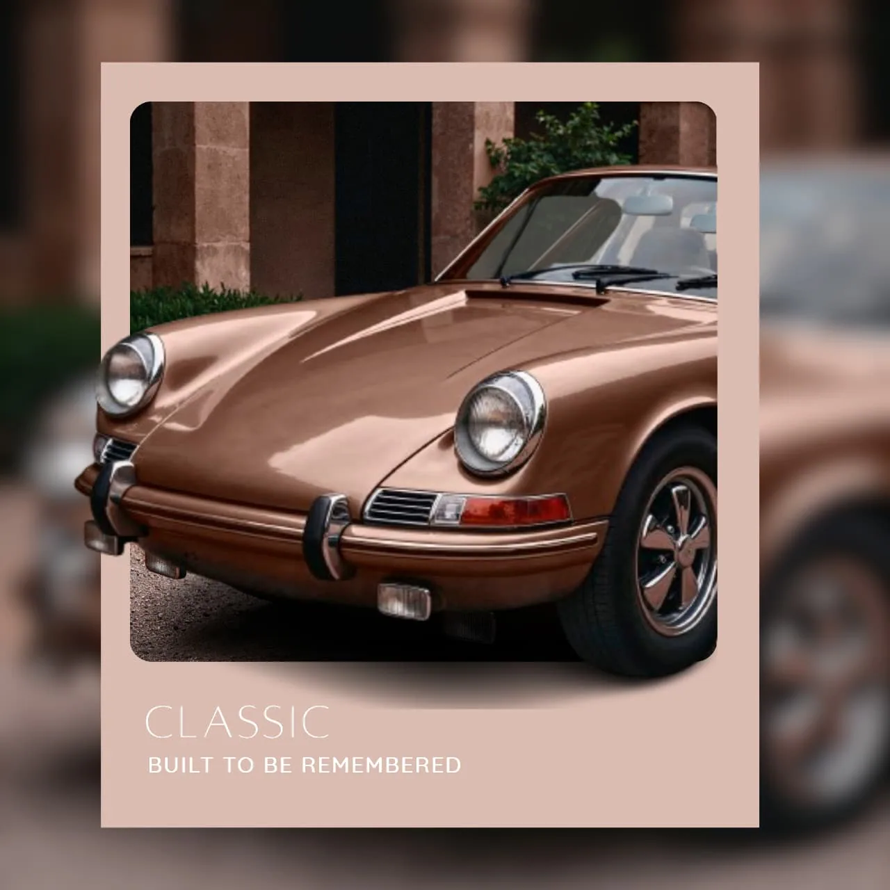
A framed, gallery-style automotive study: muted palette, film-frame crop, quiet confidence.
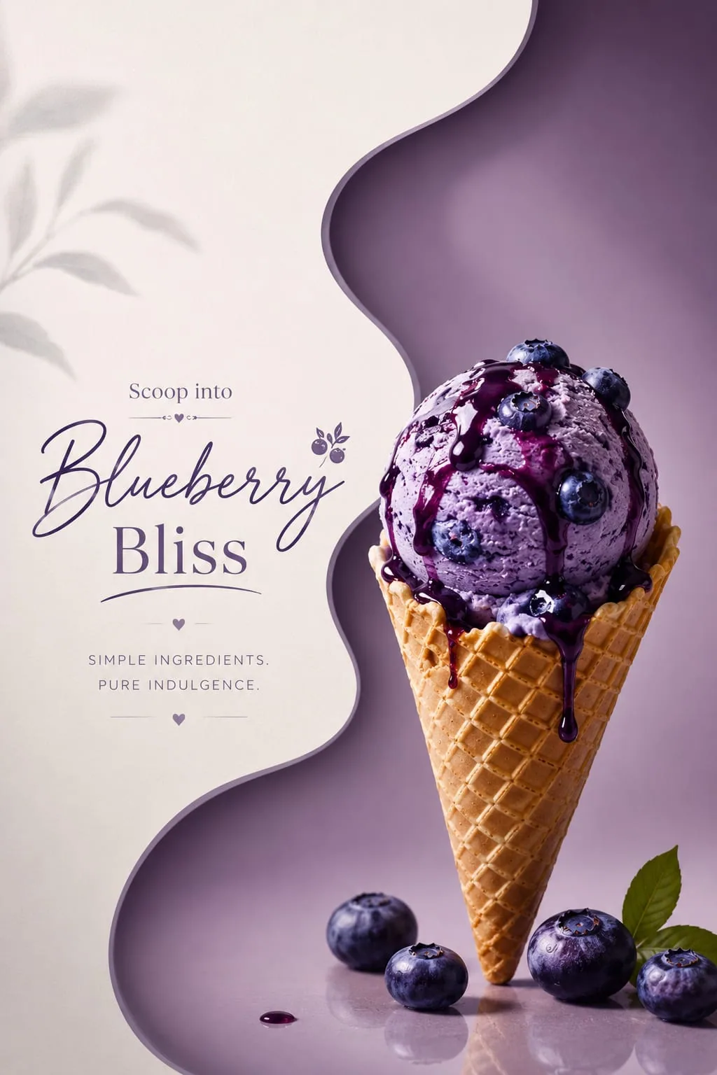
An editorial dessert poster with organic cut-outs, a script-to-serif pairing, and indulgent colour.
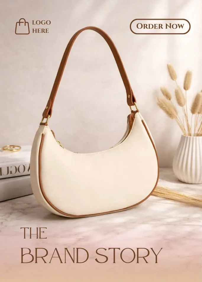
A soft-lit fashion editorial: marble, dried florals, and a serif that lets the product breathe.
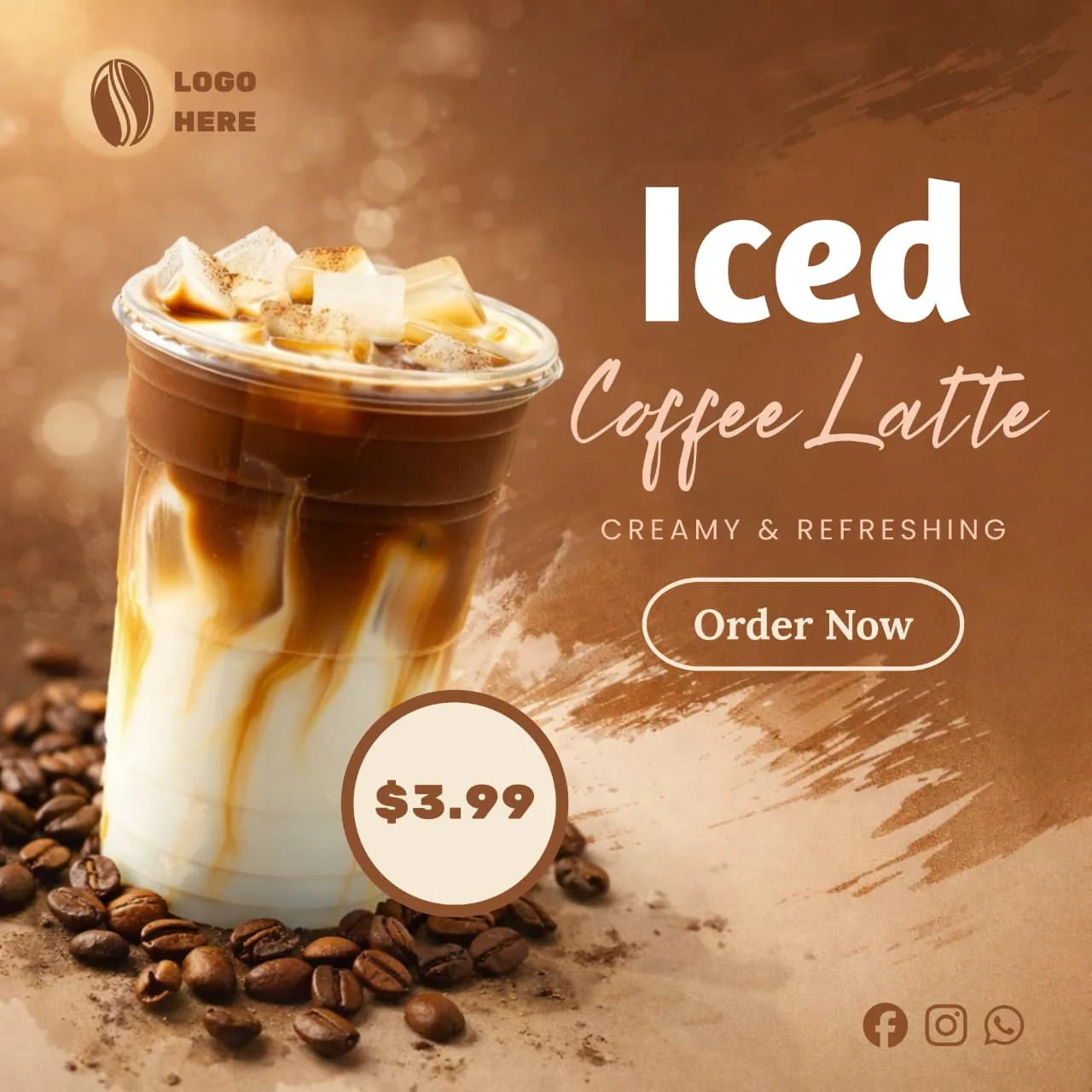
A creamy beverage promo with brushed textures, warm tones, and a crisp price token.
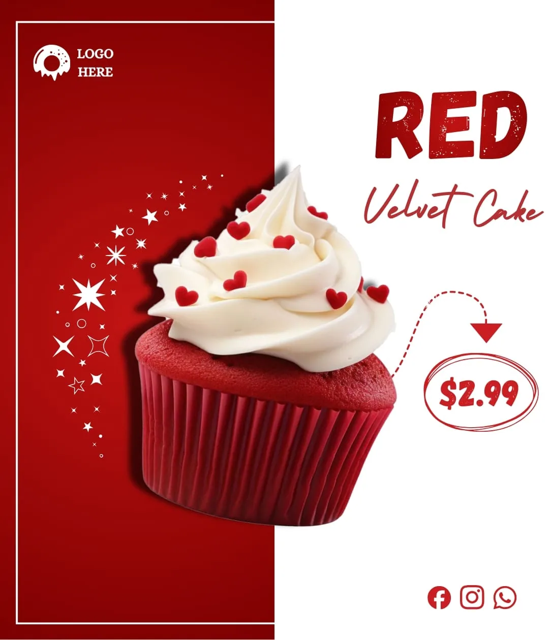
A dessert promo with sparkle detailing and a script-led headline: sweet, high-contrast, on-brand.
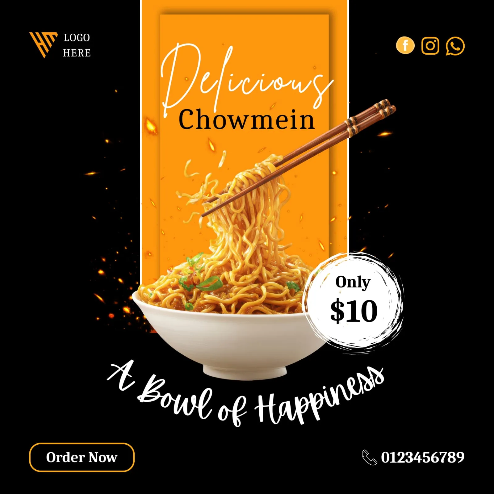
A high-energy noodle promo with spark particles, bold framing, and an appetite-first composition.
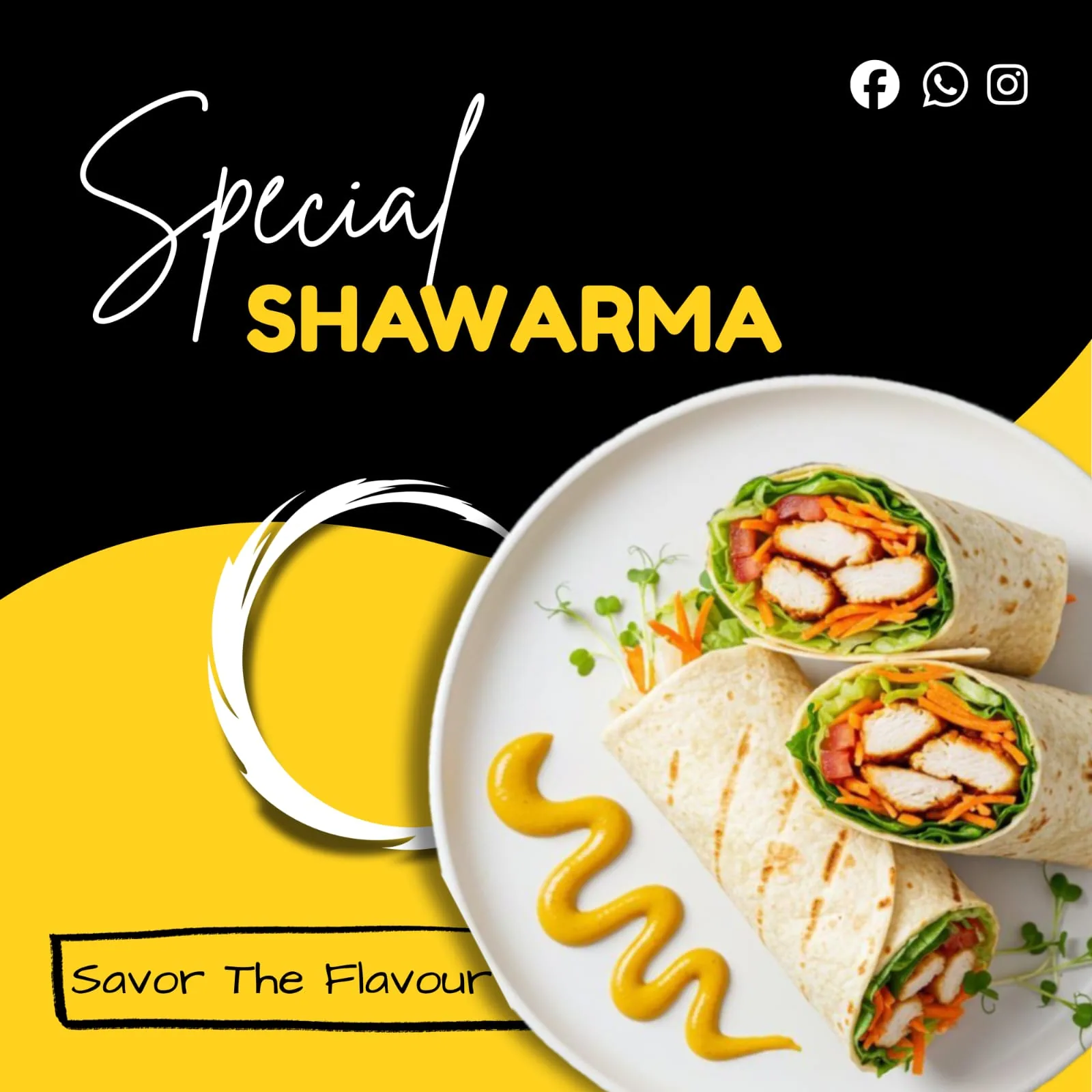
A punchy black-and-amber street-food promo pairing script with grotesque over a plated hero shot.
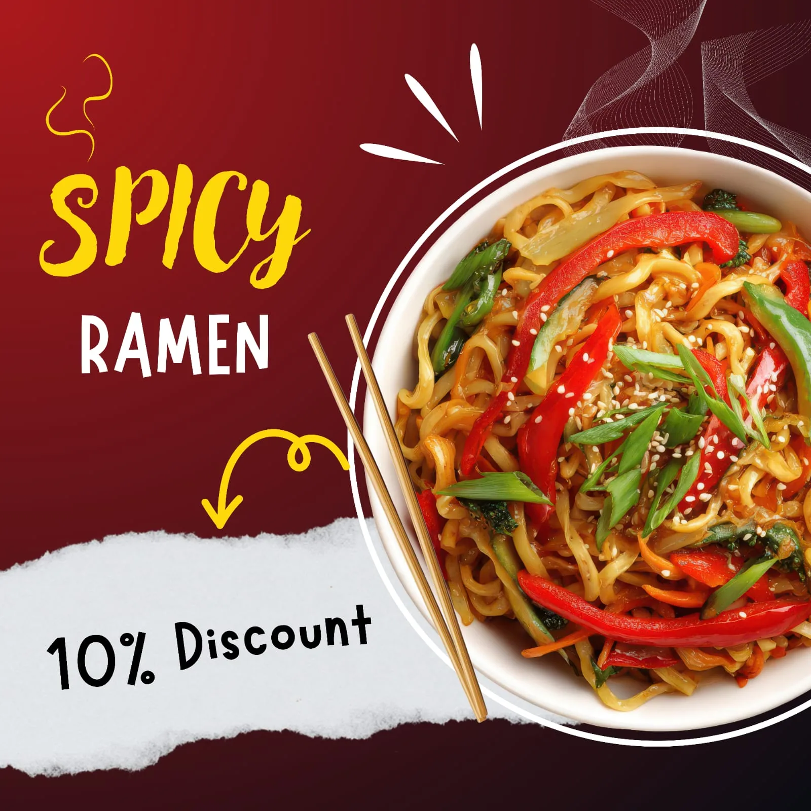
A torn-paper ramen promo with layered textures, steam accents, and a playful discount hook.
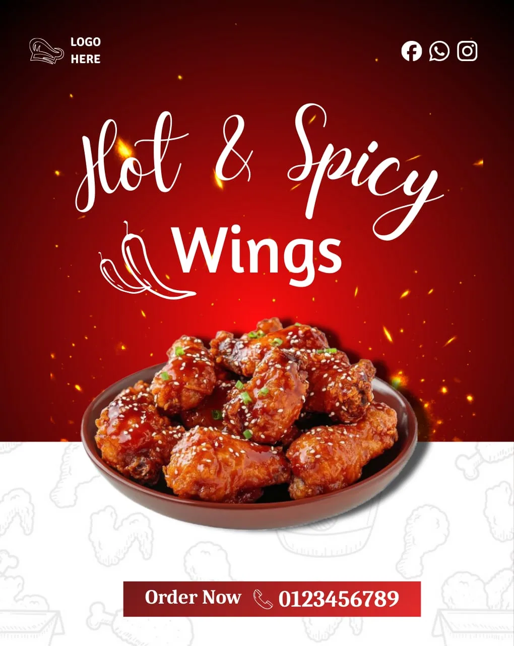
A fiery wings promo with ember sparks, a calligraphic headline, and a bold order strip.